Product
LaptopFinder.cc
I built Laptop Finder as a role-first way to choose laptops in India: short guides, a searchable index, and a lightweight advisor (“Chip”) that turns a few answers into a small set of sensible picks.
Published
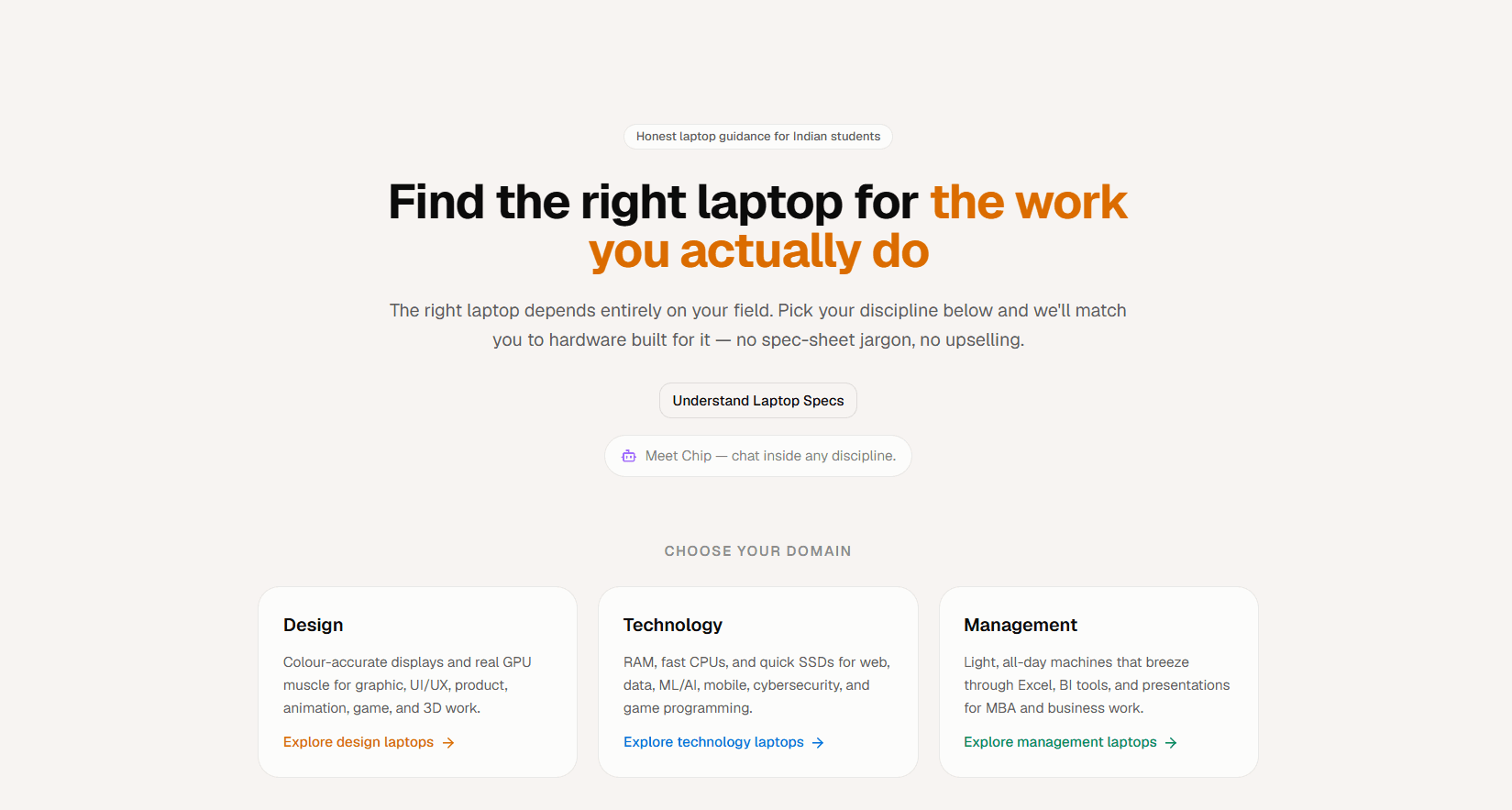
“Simple, honest laptop advice” was the line I kept coming back to while shaping Laptop Finder. The product is intentionally small: short, practical guides, a searchable index of articles, and a lightweight chat advisor called Chip. Everything points to one action on the homepage — “Find My Laptop” — so a student, a design learner, or a working professional can move from confusion to a short list without first learning a new language of specs.
Laptop buying in India is loud. You’re not just sorting through processors and RAM; you’re also dealing with marketing claims, regional availability, and the fine print of warranty and support. For creative and study-heavy work, that noise gets worse because the real questions aren’t “which chip is faster?” but “will this screen be colour-accurate enough?”, “do I have the ports I actually need?”, and “will this battery survive a day of classes?” I organised the content so it’s easy to scan, and made the entry points obvious, because the point is to reduce time-to-answer, not add another rabbit hole.
1 / 3
The failure mode here is predictable: people spend days comparing laptops and still end up with something that doesn’t fit their workflow. Or they give up and buy whatever feels safest. I needed to cut cognitive load without turning the experience into a long interrogation. The interaction had to stay brief and decision-focused — a single short flow that narrows the choice set into a few clear options.
I led with plain language and a big, unmissable CTA. On the desktop homepage, the promise is simple: “Find the right laptop for the work you actually do,” followed by a direct line about matching you to hardware “— no spec-sheet jargon, no upselling.” Under that, I used domain cards to make the mental model immediate: Design, Technology, and Management, each explained in terms of outcomes (colour-accurate displays and GPU muscle; RAM, fast CPUs and SSDs; light all-day machines for Excel, BI tools and presentations).
Chip carries the same idea into a conversational surface. Instead of asking people to translate themselves into specs, I ask them to pick a role and use-case — options like “Design aspirant”, “Design student”, and “Working professional” — and I map those answers to a small set of curated recommendations. I chose simple rule-sets and editorial judgement over spec tables because raw comparisons are where people get stuck.
To support those picks, I built an editorial layer that stays practical: guides you can scan quickly, plus a searchable index so you can look up the exact thing you’re worried about. On mobile, the blog experience keeps the same tone and structure: a “Find My Laptop” button, a “Chat with Chip” entry point, and then search and filters before you ever hit a wall of text. Even the guide topics stick to real-world decision friction — like a piece titled ““International Warranty” Is Not a Passport: What to Verify Before Moving Abroad.”
This is me replacing a specification-led mindset with role-based anchors. The interface choices are all in service of fast completion: large buttons, concise copy, and a chat-first surface that doesn’t demand commitment. I paired that with short explainers so the recommendation doesn’t feel like a black box — you can act immediately, and you can also learn just enough to feel confident about trade-offs like budget, peripherals, and warranty.
Laptop Finder now publishes role-focused guides and exposes Chip as a quick advisor for tailored picks. People can start from the homepage CTA or jump straight into chat and still arrive at recommendations quickly. The structure supports different roles and budgets without pretending there’s one “best laptop” — just a best fit for the work someone actually does.
This project sits in the overlap of product strategy, information architecture, and UX for me: a few small content pieces plus a focused interaction can do more than an exhaustive database ever will. Next, I want to close the loop with feedback and measurement — track which recommendations people click through, where they drop off, and how often the mapping rules need refinement. I also want to expand the guides by device class and budget segments, but keep the core promise intact: one short flow to a clear answer. Finally, I should add clear credit and ownership details so it’s obvious who built and maintains the product.